# 视觉格式化模型
本节的内容其实主要是 Block formatting contexts(块格式化上下文),后期会不断完善扩展相关内容。在理解 块格式化上下文 之前,其实有很多基础概念要理解。
希望读者能抛弃前端知识来读这篇文章,把自己当成在 1995 年之前只接触过 HTML 语言的小白。因为本文大篇幅都是在讲 CSS2.1 规范里的内容,这是由 W3C 向众人如何描述用 CSS 装饰丑陋的 HTML 文本的文档。让个个浏览器厂商去实现这样一个东西。其实你工作时遇到大多数 CSS 的奇异问题,就在 W3C 所撰写的文档中。比如:边距重叠、浮动元素重叠、父元素高度坍塌等问题。
首先对视觉格式化模型有个大致的概念,在进行细化。在 CSS2.1 中,在 HTML 中常常使用的概念是元素,而在 CSS 中,布局的基本单位是盒,盒总是矩形的。元素与盒并非一一对应的关系,一个元素可能生成多个盒。比如:
<li>标签除了生成自身内容的盒子,还会多出一个盒子来装前面的标识。- CSS 规则中的伪元素
::after、::before也可能生成盒子。 - HTML 中的文本节点也可能会生成盒子。
display属性为none的元素则不生成盒子。
决定盒子如何布局的主要有 Positioning schemes(定位方案)、Formatting contexts(格式化上下文) 等概念。这些概念都是 W3C 提出来并赋予意义的,不是我凭空说出的。所以后面会同时放出源文、译文。避免因对源文翻译错误,而导致意义理解错误。副本是永远无法成为真货的,是存在瑕疵的。
Positioning schemes(定位方案) 是用来 定位,其方法有三种:
- Normal flow(常规流)
- Floats(浮动)
- Absolute positioning(绝对定位)
Formatting contexts(格式化上下文) 是一块 渲染规则,其种类有两种:
提示
CSS3 新增了两种格式化上下文,分别是 GridLayout Formatting Contexts(网格布局格式化上下文)[13]、Flex Formatting Contexts(自适应格式化上下文)[14],这里就不涉及。
常规流是页面,大部分盒排布于常规流中。常规流中的盒必定位于某一格式化上下文中,不能同时存在多个格式化上下文。在块级格式化上下文中,盒呈纵向排布,在行内格式化上下文中,盒则呈横向排布。
以上都只是简单的介绍,下面会对某些概念进行详细介绍。
注意
因为英文的专业术语太长,以下会将 Block fomatting contexts(块格式化上下文)简化成 BFC,Inline formatting contexts(行内块格式化上下文)简化成 IFC。如果有新概念,会出现一次源文和译文,后面就直接用译文进行表达。
# 包含块
点击查看 [W3C] Containing blocks
In CSS 2.1, many box positions and sizes are calculated with respect to the edges of a rectangular box called a containing block. In general, generated boxes act as containing blocks for descendant boxes; we say that a box "establishes" the containing block for its descendants. The phrase "a box's containing block" means "the containing block in which the box lives," not the one it generates.
Each box is given a position with respect to its containing block, but it is not confined by this containing block; it may overflow.1
点击查看 [译文] 包含块
CSS 2.1 中,很多盒的位置和大小是根据被称为包含块的矩形框的边界计算的。一般把生成的盒作为后代盒的包含块,我们说一个盒为其后代“建立”了包含块。“一个盒的包含块”表示“盒所在的包含块”,而不是它生成的(包含块)。
每个盒都根据其包含块确定了一个位置,但它不受该包含块的限制,可能会溢出。
<style>
  #div1 {
    width: 100px;
    height: 100px;
    /* 裁剪 */
    /* overflow: hidden; */
  }
  #p1 {
    width: 200px;
    height: 200px;
    background-color: chocolate;
  }
</style>
<div id="div1">
  <p id="p1">
    <span id="span1"></span>
  </p>
  <p id="p2">
    <span id="span2"></span>
  </p>
</div>
2
3
4
5
6
7
8
9
10
11
12
13
14
15
16
17
18
19
20
21
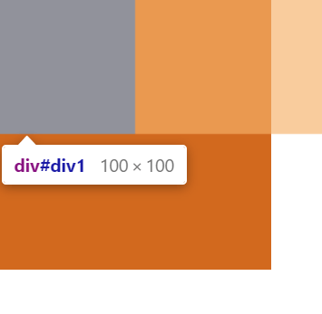
根据上述代码配合概念可以得出:
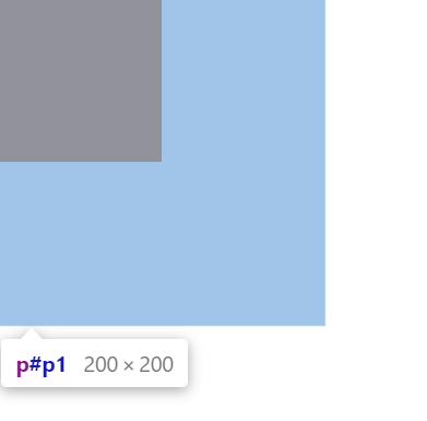
p1、p2的包含块是div1,span1的包含块是p1,span2的包含块是p2,以此类推。span1会根据包含块p1来确定自己的位置,p1会根据包含块div1来确定自己的位置,p2也会根据包含块div1来确定自己的位置,以此类推。一层一层确定位置。p1会溢出,div1的overflow: hidden这个只是裁剪,看不见p1溢出的内容,并不是p1没有溢出。
未裁剪的效果图:
裁剪后p1元素的内容还是不变,该溢出的就溢出,只是看不见了。裁剪后的效果图:
# 控制盒生成
点击查看 [W3C] Controlling box generation
The following sections describe the types of boxes that may be generated in CSS 2.1. A box's type affects, in part, its behavior in the visual formatting model. The 'display' property, described below, specifies a box's type.
点击查看 [译文] 控制盒生成
下面的各节描述了 CSS 2.1 中可能生成的盒的类型。盒的类型对其在视觉格式化模型中的行为有一定影响。下面描述的'display'属性指定了盒的类型
这个比较容易理解,就是display属性指定了盒的类型,display属性值和盒的类型对应关系会在块级元素与块盒、行内级元素与行内盒中说明。
# 块级元素与块盒
点击查看 [W3C] Block-level elements and block boxes
Block-level elements are those elements of the source document that are formatted visually as blocks (e.g., paragraphs). The following values of the 'display' property make an element block-level: 'block', 'list-item', and 'table'.
Block-level boxes are boxes that participate in a block formatting context. Each block-level element generates a principal block-lsevel box that contains descendant boxes and generated content and is also the box involved in any positioning scheme. Some block-level elements may generate additional boxes in addition to the principal box: 'list-item' elements. These additional boxes are placed with respect to the principal box.
Except for table boxes, which are described in a later chapter, and replaced elements, a block-level box is also a block container box. A block container box either contains only block-level boxes or establishes an inline formatting context and thus contains only inline-level boxes. Not all block container boxes are block-level boxes: non-replaced inline blocks and non-replaced table cells are block containers but not block-level boxes. Block-level boxes that are also block containers are called block boxes.
The three terms "block-level box," "block container box," and "block box" are sometimes abbreviated as "block" where unambiguous.
点击查看 [译文] 块级元素与块盒
块级元素是源文档中那些被格式化成视觉上的块的元素(例如,段落)。'display'属性的下列值能让一个元素变成块级的:'block','list-item'和'table'
块级盒是参与块格式化上下文的盒。每个块级元素生成一个主块级盒(principal block-level box),用来包含后代盒及生成的内容,并且任何定位方案都与该盒有关。有些块级元素可能会生成除主盒外的额外的盒:'list-item'元素。这些额外的盒根据主盒来放置
除了后面章节描述的表格盒与替换元素外,一个块级盒也是块容器盒。一个块容器盒要么只包含块级盒,要么建立了行内格式化上下文并因此只包含行内级盒。不是所有的块容器盒都是块级盒:非替换的行内块与非替换的表格单元是块级容器,但不是块级盒。作为块级容器的块级盒也叫块盒
“块级盒(block-level box)”,“块容器盒(block container box)”和“块盒(block box)”这三个术语在没有歧义的时候就简称为“块(block)”
block-level elements(块级元素) 就是display属性值为block、list-item、table的元素,每个块级元素会生成一个主盒子,这种盒子的专业术语叫 block-level box(块级盒)。有些元素会比较特殊,例如:<li>前面的标识会生成额外的盒。除了表格与替换元素外,一个块级盒也是 block container box(块容器盒)。替换元素其实就是<img>、input、textarea、select、object这种元素。没有实际内容,里面也不能放子元素,所以他只能是块级盒,而不是一种容器(块容器盒)。大多数元素都是非替换元素,并且自身也能当容器容纳别的元素,例如:<div><p></p></div>。块容器盒的内容有两种情况:要么是只包含块级盒,要么是只包含行内级盒(这种情况需要创建 IFC)。是块级盒、又是块容器盒的盒子,我们可以称为 块盒(block box)。
注意
有些地方 box 翻译成 盒 或者 盒子。其实两者都一样,只是少了一个子而已。
block-level box 会翻译成 块级盒 或者 块级盒子,block container box 会翻译成 块容器盒 或者 块容器盒子,block box 会翻译成 块盒 或者 块盒子。道理一样。
提示
如果不能理解,就可以理解成,雌性(块级盒)、雄性(块容器盒)、雌雄同体(块盒),雌性有子房(容器),雄性没有。但雄性有特殊器官(内容),雌雄同体有容器、又有内容。以上例子只是为了理解,逻辑并不严谨。
# 匿名块盒
点击查看 [W3C] Anonymous block boxes
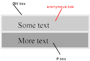
Anonymous block boxes In a document like this:
<div>
  Some text
  <p>More text</p>
</div>
2
3
4
(and assuming the DIV and the P both have 'display: block'), the DIV appears to have both inline content and block content. To make it easier to define the formatting, we assume that there is an anonymous block box around "Some text".
点击查看 [译文] 匿名块盒
在一个这样的文档中:
<div>
  Some text
  <p>More text</p>
</div>
2
3
4
(假设 DIV 和 P 都有'display: block'),DIV 似乎既有行内内容也有块内容。为了更容易定义格式化,我们假设在"Some text"四周有一个匿名块盒
文档中还有比较详细的内容没有讲解,建议查看源文或者译文。
# 行内级元素与行内盒
点击查看 [W3C] Inline-level elements and inline boxes
Inline-level elements are those elements of the source document that do not form new blocks of content; the content is distributed in lines (e.g., emphasized pieces of text within a paragraph, inline images, etc.). The following values of the 'display' property make an element inline-level: 'inline', 'inline-table', and 'inline-block'. Inline-level elements generate inline-level boxes, which are boxes that participate in an inline formatting context.
An inline box is one that is both inline-level and whose contents participate in its containing inline formatting context. A non-replaced element with a 'display' value of 'inline' generates an inline box. Inline-level boxes that are not inline boxes (such as replaced inline-level elements, inline-block elements, and inline-table elements) are called atomic inline-level boxes because they participate in their inline formatting context as a single opaque box.
点击查看 [译文] 行内级元素与行内盒
行内级元素是源文档中那些不会形成新内容块的元素,内容分布于多行(例如,强调段落中的一部分文本,行内图片等等)。'display'属性的下列值能让一个元素变成行内级:'inline','inline-table'和'inline-block'。行内级元素生成行内级盒,即参与行内格式化上下文的盒
行内盒是(特殊的)行内级盒,其内容参与了它的包含行内格式化上下文(containing inline formatting context)。'display'值为'inline'的非替换元素会生成一个行内盒。不属于行内盒的行内块级盒(例如,行内级替换元素,inline-block 元素和 inline-table 元素)被称为原子行内级盒(atomic inline-level boxes),因为它们作为单一的不透明盒(opaque box)参与其行内格式化上下文
与块级元素生成块级盒一样,inline-level elements(行内级元素) 也会生成 inline-level boxes(行内级盒)。display属性值为inline、inline-table、inline-block的元素就是行内级元素,所生成的行内级盒会参加 IFC。大多数行内级元素所生成的行内级盒不仅会参与 IFC,其自身内部也会参与 IFC,这种我们可以称为行内盒。但有一些元素不太一样,例如:行内级替换元素,inline-block元素和inline-table元素,只有自己参加 IFC,自己的内容不参加 IFC,我们称为 atomic inline-level boxes(原子行内级盒)。
理解
你可以把格式化上下文 IFC 或者 BFC 当成背景颜色,假设 IFC 是黄色、BFC 是蓝色。把行内盒想象成背景色为透明的盒子,这样行内盒里的颜色会是祖先的背景色(黄色),就是其内部参加到了祖先中的 IFC 渲染机制。然后把原子行内级盒想象成背景是白色的盒子,里面是不参加格式化上下文的。
# 匿名行内盒
点击查看 [W3C] Anonymous inline boxes
Any text that is directly contained inside a block container element (not inside an inline element) must be treated as an anonymous inline element.
In a document with HTML markup like this:
<p>Some <em>emphasized</em> text</p>
the <p> generates a block box, with several inline boxes inside it. The box for "emphasized" is an inline box generated by an inline element (<em>), but the other boxes ("Some" and "text") are inline boxes generated by a block-level element (<p>). The latter are called anonymous inline boxes, because they do not have an associated inline-level element.
Such anonymous inline boxes inherit inheritable properties from their block parent box. Non-inherited properties have their initial value. In the example, the color of the anonymous inline boxes is inherited from the P, but the background is transparent.
White space content that would subsequently be collapsed away according to the 'white-space' property does not generate any anonymous inline boxes.
If it is clear from the context which type of anonymous box is meant, both anonymous inline boxes and anonymous block boxes are simply called anonymous boxes in this specification.
There are more types of anonymous boxes that arise when formatting tables.
点击查看 [译文] 匿名行内盒
任何被直接包含在一个块容器元素中(不在行内元素里面)的文本,必须视为一个匿名行内元素
在一个有如下 HTML 标记的文档里:
<p>Some <em>emphasized</em> text</p>
<p>会生成一个块盒,里面还有几个行内盒。"emphasized"的盒是一个由行内元素(<em>)生成的行内盒,但其它盒("Some"和"text")都是由块级元素(<p>)生成的行内盒。后者叫做匿名行内盒,因为它们没有与之相关的行内级元素
这种匿名行内盒从它们的父级块盒继承了可继承的属性,不可继承的属性取其初始值。示例中,匿名行内盒的颜色是从 P 继承的,但背景是透明的
对于后续会根据'white-space'属性合并起来的空白字符内容,不会生成任何匿名行内盒
如果知道上下文中匿名盒是哪种含义,本规范中的匿名行内盒和匿名块盒都可以简称为匿名盒
在格式化表格时会出现更多的匿名盒类型
<p>Some <em>emphasized</em> text</p>
这个跟匿名块盒是差不多的意思,只不过是 anonymous inline boxes(匿名行内盒)。运行后的效果就是一行文字,上述代码会产生两个匿名行内盒来分别包裹的Some和text文本。这也说明了,CSS 的世界里是按照盒子来布局的。必须要盒子才能布局。样式继承关系文档中有说明,这里暂时不细讲,避免篇幅过长。
# 定位方案
点击查看 [W3C] Positioning schemes
In CSS 2.1, a box may be laid out according to three positioning schemes:
- Normal flow. In CSS 2.1, normal flow includes block formatting of block-level boxes, inline formatting of inline-level boxes, and relative positioning of block-level and inline-level boxes.
- Floats. In the float model, a box is first laid out according to the normal flow, then taken out of the flow and shifted to the left or right as far as possible. Content may flow along the side of a float.
- Absolute positioning. In the absolute positioning model, a box is removed from the normal flow entirely (it has no impact on later siblings) and assigned a position with respect to a containing block.
点击查看 [译文] 定位方案
CSS 2.1 中,一个盒可能会根据三种定位方案来布局:
- 常规流 CSS 2.1 中,常规流包括块级盒的块格式化(block formatting),行内级盒的行内格式化和块级与行内级盒的相对定位
- 浮动 在浮动模型中,盒先根据常规流来放置,然后从常规流中取出来并尽可能远地向左或向右移动。其它内容可能沿着浮动(盒)的一侧排列。
- 绝对定位 在绝对定位模型中,一个盒会从常规流中全部移除(它不会影响后面的兄弟元素)并根据包含块确定位置
注意
并不是说浮动、绝对定位中就不存在格式化上下文,BFC、IFC 也是存在其中的。可以理解浮动、绝对定位的盒子,最外面一层是特殊的盒子,里面还是跟常规流的布局差不多。
# 常规流
点击查看 [W3C] Normal flow
Boxes in the normal flow belong to a formatting context, which may be block or inline, but not both simultaneously. Block-level boxes participate in a block formatting context. Inline-level boxes participate in an inline formatting context.
点击查看 [译文] 常规流
常规流中的盒属于一个格式化上下文,可能是块或是行内(格式化上下文),但不能两者都是。块级盒参与块格式化上下文。行内级盒参与行内格式化上下文
意思是常规流中的盒属于某个格式化上下文,要么 BFC、要么 IFC,不能两者都是。块级盒必定参与块格式化上下文,行内级盒必定参与行内格式化上下文。后面这一句很关键。
# 浮动
点击查看 [W3C] Floats
A float is a box that is shifted to the left or right on the current line. The most interesting characteristic of a float (or "floated" or "floating" box) is that content may flow along its side (or be prohibited from doing so by the 'clear' property). Content flows down the right side of a left-floated box and down the left side of a right-floated box. The following is an introduction to float positioning and content flow; the exact rules governing float behavior are given in the description of the 'float' property.
A floated box is shifted to the left or right until its outer edge touches the containing block edge or the outer edge of another float. If there is a line box, the outer top of the floated box is aligned with the top of the current line box.
If there is not enough horizontal room for the float, it is shifted downward until either it fits or there are no more floats present.
Since a float is not in the flow, non-positioned block boxes created before and after the float box flow vertically as if the float did not exist. However, the current and subsequent line boxes created next to the float are shortened as necessary to make room for the margin box of the float.
A line box is next to a float when there exists a vertical position that satisfies all of these four conditions: (a) at or below the top of the line box, (b) at or above the bottom of the line box, (c) below the top margin edge of the float, and (d) above the bottom margin edge of the float.
Note: this means that floats with zero outer height or negative outer height do not shorten line boxes.
If a shortened line box is too small to contain any content, then the line box is shifted downward (and its width recomputed) until either some content fits or there are no more floats present. Any content in the current line before a floated box is reflowed in the same line on the other side of the float. In other words, if inline-level boxes are placed on the line before a left float is encountered that fits in the remaining line box space, the left float is placed on that line, aligned with the top of the line box, and then the inline-level boxes already on the line are moved accordingly to the right of the float (the right being the other side of the left float) and vice versa for rtl and right floats.
The border box of a table, a block-level replaced element, or an element in the normal flow that establishes a new block formatting context (such as an element with 'overflow' other than 'visible') must not overlap the margin box of any floats in the same block formatting context as the element itself. If necessary, implementations should clear the said element by placing it below any preceding floats, but may place it adjacent to such floats if there is sufficient space. They may even make the border box of said element narrower than defined by section 10.3.3. CSS2 does not define when a UA may put said element next to the float or by how much said element may become narrower.
点击查看 [译文] 浮动
浮动(盒)就是一个在当前行向左或向右移动的盒。浮动盒最有意思的特性是其它内容会沿着它的一侧排列(可以通过'clear'属性禁止这种行为)。其它内容会沿着左浮动盒的右侧,右浮动盒的左侧排列。下面是浮动定位及其内容流(flow)的介绍,控制浮动行为的准确规则见'float'属性中的说明
一个浮动盒会向左或向右移动,直到其外边界挨到包含块边界或者另一个浮动盒的外边界。如果存在行框,浮动盒的上外(边界)会与当前行框的上(边界)对齐
如果没有足够的水平空间来浮动,它会向下移动,直到空间合适或者再没出现其它浮动
因为浮动(盒)不在(常规)流内,在浮动盒之前或者之后创建的非定位(non-positioned)块盒会垂直排列,就像浮动不存在一样。然而,会根据需要缩短挨着(next to)浮动(盒)创建的当前(行)及后续行框,以便给浮动(盒)的外边距框让出空间
行框挨着(next to)浮动盒的条件是存在一个垂直位置,同时满足这 4 个条件:(a)位于行框的顶端或顶端下方,(b)位于行框底端或底端上方,(c)在浮动(盒)上外边距边界下方并且(d)在浮动(盒)下外边距边界上方
注意:也就是说 0 外高度(outer height)或者负外高度(盒)的浮动不会缩短行框
如果一个缩短的行框小到无法容纳任何内容了,那么该行框会向下移动(并重新计算其宽度)直到有些内容能适应(它的空间)或者再没出现其它浮动了。当前行里浮动盒之前的所有内容都会在浮动方向另一侧的相同行重新排列(reflow)。换句话说,如果行内级盒被放在同一行中的左浮动元素之前,并且适应剩余的行框空间,左浮动(盒)就放在该行,与行框的顶端对齐,然后,相应地,该行中已经放好的这个内联级盒会被移动到浮动盒右边(右边是左浮动的另一侧),对于 rtl 和右浮动,反之亦然
表格,块级替换元素或常规流中建立了新的块格式化上下文的元素(例如一个'overflow'不为'visible'的元素)不能和与元素自身处于同一块格式化上下文中的任何浮动(盒)的外边距框重叠。如果必要的话,实现应该把它放在所有之前出现的浮动(盒)下方,以清除(clear)该元素(受到的浮动影响),如果空间充足的话,可以放得与浮动(盒)相邻。它们甚至会让该元素的边框框比 10.3.3 小节中定义的更窄。CSS2 没有定义 UA 什么情况下可以把该元素挨着浮动(盒)放以及该元素可以变得多窄
上述文中的第四段话和最后一段话是重点,第五段话就只是难理解。其实第六段话就是第五段话的另一种说法,是相同的意思。
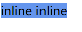
先看看难理解的第五段话,可以看一个例子:
<style>
  #parent {
    width: 120px;
  }
  #box1 {
    float: left;
    width: 60px;
    height: 60px;
    /* height: 0px; */
    background-color: cadetblue;
  }
  #box2 {
    display: inline;
    background-color: cornflowerblue;
  }
</style>
<div id="parent">
  <div id="box1">float</div>
  <div id="box2">inline inline</div>
</div>
2
3
4
5
6
7
8
9
10
11
12
13
14
15
16
17
18
19
20
存在一个垂直高度,在浮动盒上下边距之间,也在行框顶端底端之间。行框就会挨着浮动盒。也会缩短行框的宽度。
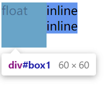
如果取消注释,让高度为 0,那么浮动盒上下边距的高度就是为 0。这样子垂直高度就不存在了,这样行框不会挨着浮动盒了,也不会缩短了。
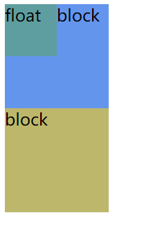
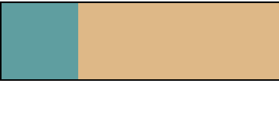
# 浮动元素重叠
稍微讲一下第四段话,因为这是一个浮动盒覆盖问题,其实BFC的文中最后一段话也是在描述这个问题,后续我们会解决这个问题。
<style>
  #box1 {
    float: left;
    width: 50px;
    height: 50px;
    background-color: cadetblue;
  }
  #box2 {
    width: 100px;
    height: 100px;
    background-color: cornflowerblue;
  }
  #box3 {
    width: 100px;
    height: 100px;
    background-color: darkkhaki;
  }
</style>
<div id="box1">float</div>
<div id="box2">block</div>
<div id="box3">block</div>
2
3
4
5
6
7
8
9
10
11
12
13
14
15
16
17
18
19
20
21
因为浮动盒不在常规流内,在浮动盒之前或者之后创建的非定位块盒会垂直排列,就像浮动不存在一样。也就是box2的块盒是不受影响的,该怎么排就怎么排。注意里面的文本是需要一个匿名行内级盒的,box2产生的匿名行内级盒所在的行框会缩短,给浮动盒腾出空间,在视觉上就是 box2 里的文字围绕在 box1 旁边了。这个也是 浮动元素重叠问题。
文档的最后一段话也是浮动元素重叠的解决方法,但我们现在还不知道BFC是什么东西,所以需要等到后面进行讲解。在这里其实可以看出很多奇怪的问题,是 W3C 制定的。想要解决这些问题,也只能用 W3C 给出的方法。
# 块格式化上下文
点击查看 [W3C] Block formatting contexts
Floats, absolutely positioned elements, block containers (such as inline-blocks, table-cells, and table-captions) that are not block boxes, and block boxes with 'overflow' other than 'visible' (except when that value has been propagated to the viewport) establish new block formatting contexts for their contents.
In a block formatting context, boxes are laid out one after the other, vertically, beginning at the top of a containing block. The vertical distance between two sibling boxes is determined by the 'margin' properties. Vertical margins between adjacent block-level boxes in a block formatting context collapse.
In a block formatting context, each box's left outer edge touches the left edge of the containing block (for right-to-left formatting, right edges touch). This is true even in the presence of floats (although a box's line boxes may shrink due to the floats), unless the box establishes a new block formatting context (in which case the box itself may become narrower due to the floats).
点击查看 [译文] 块格式化上下文
浮动,绝对定位的元素,非块盒的块容器(例如 inline-blocks,table-cells 和 table-captions),以及’overflow’不为’visible’的块盒(当该值已被传播到视口时除外)会为其内容建立新的块格式化上下文。
在一个块格式化上下文中,盒在垂直方向一个接一个地放置,从包含块的顶部开始。两个兄弟盒之间的垂直距离由'margin'属性决定。同一个块格式化上下文中的相邻块级盒之间的垂直外边距会合并。
在一个块格式化上下文中,每个盒的左外边界(left outer edge)挨着包含块的左外边界(对于从右向左的格式化,右外边界挨着)。即使存在浮动(尽管一个盒的行框可能会因为浮动而收缩 译注:环绕浮动元素放置的行框比正常的行短一些),这也成立。除非该盒建立了一个新的块格式化上下文(这种情况下,该盒自身可能会因为浮动变窄)。
文档中的三段话是非常关键的三段话,建议多读几遍。其中第一段话是 BFC 的 创建方式,第二段话和第三段话均是 BFC 的 布局规则。其中的第三段话,也是在描述浮动元素覆盖问题,后半句就是如何解决该问题。
提示
网上很多对 BFC 对其总结,只是对创建方式和布局规则,仅此而已。没有告诉你为什么,这种加工过的内容,我放在最后的其他中。不建议先去查看。
# 边距重叠
根据规则文档的第二段话:在 BFC 中,盒子会垂直方向上一个一个放置,从包含块的顶部开始。在同一个 BFC 中,两个兄弟盒之间的垂直距离由'margin'属性决定。同一个 BFC 中的相邻块级盒之间的 垂直外边距会合并。那我们就写个例子,来看看是否会垂直放置、相邻盒的垂直外边距合并。
<style>
  #box1 {
    width: 100px;
    height: 100px;
    background-color: cadetblue;
    margin: 10px;
  }
  #box2 {
    width: 100px;
    height: 100px;
    background-color: burlywood;
    margin: 10px;
  }
  .bfc {
    overflow: hidden;
    /* 以下方式均可以,不限于以下方式 */
    /* position: absolute; */
    /* position: fixed; */
    /* float: left; */
    /* overflow: auto; */
    /* display: inline-block; */
  }
</style>

<div id="parent">
  <div id="box1"></div>
  <!-- <div class="bfc"> -->
  <div id="box2"></div>
  <!-- </div> -->
</div>
2
3
4
5
6
7
8
9
10
11
12
13
14
15
16
17
18
19
20
21
22
23
24
25
26
27
28
29
30
运行后效果如下:
box1和box2确实一个一个垂直放置,并且还是从包含块parent的顶部开始。box1和box2相邻,很明显垂直方向的边距重叠了。
那么如何让box1和box2不重叠呢?其实很容易,只要打破第二段话里的条件——在一个块格式化上下文中,让box1和box2不在同一个 BFC 中。那怎么样才能不在 BFC 中呢?这个也很简单,其中一个创建新的 BFC。新的 BFC 那又如何创建?看文档的第一段话。
选择不影响布局结构的样式取消注释,box2创建了新 BFC。运行后效果如下:

box1和box2之间的距离明显是累加了。
理解
BFC(父)中的子元素创建的 BFC(子),这两个不是同个 BFC。就像你儿子的爸爸(你)和你的爸爸,是同一个爸爸(人)吗?
注意
不要忘了样式原本的功能,创建 BFC 只是某些样式属性的 附赠品。不要为了创建 BFC 而忽略样式自身的效果。就像你买东西就只考虑其赠品吗?都是根据自己的需求去选择,其次再根据有无赠品进行挑选。如果只是创建 BFC,可以用新的属性值display: flow-root,这个可以创建无副作用的 BFC。
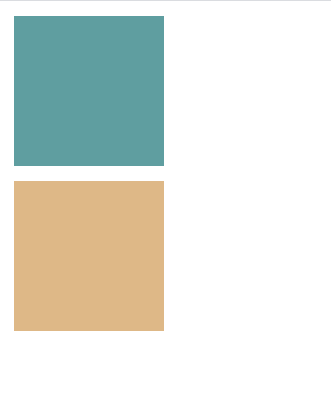
# 解决浮动元素重叠
在讲浮动的时候,里面的规则描述了一个浮动元素重叠的问题。我们可以根据浮动文档中的最后一段话,以及 BFC 文档中的最后一段话。
浮动文档中的最后一段话大致的意思是(结合下图代码):常规流中如果B元素创建了新的 BFC,那么B元素就不能和浮动A元素的外边框重叠,因为他们自身(不是内容)处于同一个 BFC 中,也就是parent元素。此时此刻,如果A元素的右侧的空间足够,那么B元素就相邻A元素,不过这样A元素的宽度可能会小一些。如果右侧空间不足,那么就放在A元素的下方,来清除A元素浮动带来的影响。
BFC 文档中的最后一段话大致的意思是(结合下图代码):在parent元素的 BFC 下,即使存在浮动A元素,B元素的左外边界也要挨着parent元素(B元素的包含块),这种情况B元素里的行框(可以想成B元素里面文字)可能会缩短一些。除非B元素建立新的 BFC,那就不用按照上述的规则布局了。
<div id="parent" class="BFC">
  <div id="A" class="left-float"></div>
  <div id="B" class="block BFC"></div>
</div>
2
3
4
这样的话就可以知道如何解决浮动元素重叠问题,将box2创建一个新的 BFC,创建 BFC 的方法已经知道了(BFC 文档第一段话)。
<style>
  #box1 {
    float: left;
    width: 50px;
    height: 50px;
    background-color: cadetblue;
  }
  #box2 {
    overflow: hidden;
    width: 100px;
    height: 100px;
    background-color: cornflowerblue;
  }
  #box3 {
    width: 100px;
    height: 100px;
    background-color: darkkhaki;
  }
</style>
<div id="box1">float</div>
<div id="box2">block</div>
<div id="box3">block</div>
2
3
4
5
6
7
8
9
10
11
12
13
14
15
16
17
18
19
20
21
22
运行效果如下:

# 父元素高度坍塌
在前面说到的浮动流是脱离常规流的,这意味着在常规流的元素的高度,是不包括浮动流的元素。相当于不存在一样,这样会导致父元素高度坍塌的现象。如下:
<style>
  .parent {
    border: 2px solid;
    background-color: burlywood;
  }
  .box1 {
    width: 100px;
    height: 100px;
    background-color: cadetblue;
    float: left;
  }
</style>
<div class="parent">
  <div class="box1"></div>
</div>
2
3
4
5
6
7
8
9
10
11
12
13
14
15
运行效果如下:

那又如何解决这一现象呢?介于本节内容,肯定有人就连想到了 BFC,创建 BFC 就一定能解决吗?那你根据呢?我们要有依有据。
那么你可能会在以上中的源文或译文中查找,结果会发现上面的源文或译文中没有相关的问题。其实 W3C 把该现象的解决方法写在了另一章节(视觉格式化模型细节章节[5])中,上面所摘选的源文和译文都是来自视觉格式化模型章节[3]。
在文档的 10.6.7 章节中,W3C 这么说:
点击查看 [W3C] 'Auto' heights for block formatting context roots
In certain cases (see, e.g., sections 10.6.4 and 10.6.6 above), the height of an element that establishes a block formatting context is computed as follows:
If it only has inline-level children, the height is the distance between the top of the topmost line box and the bottom of the bottommost line box.
If it has block-level children, the height is the distance between the top margin-edge of the topmost block-level child box and the bottom margin-edge of the bottommost block-level child box.
Absolutely positioned children are ignored, and relatively positioned boxes are considered without their offset. Note that the child box may be an anonymous block box.
In addition, if the element has any floating descendants whose bottom margin edge is below the element's bottom content edge, then the height is increased to include those edges. Only floats that participate in this block formatting context are taken into account, e.g., floats inside absolutely positioned descendants or other floats are not.
点击查看 [译文] 块格式化上下文中的'Auto'高度
特定情况下(例如,见上面的 10.6.4 节和 10.6.6 节),一个建立了块格式化上下文的元素的高度按照如下规则计算:
如果它只含有行内级子级,高度就是最高的行框的顶端与最低的行框的底端之间的距离
如果它只含有块级子级,高度就是最高的块级子级盒的上外边距边界到最低的块级子级盒的下外边距边界之间的距离
绝对定位的子级会被忽略,并且相对定位的盒不考虑其偏移。注意,子级盒可以是一个匿名块盒
此外,如果该元素含有任意下外边距边界位于元素的内容下边界下方的的浮动后代,那么高度增加至能够包含这些边界。只考虑参与此块级格式化上下文的浮动,例如,不考虑绝对定位的后代中的浮动或其它浮动
第一段话是前提,是建立 BFC 的元素的高度计算方法。最后一段话就是解决问题的关键,在计算建立 BFC 的元素的高度时,如果该元素内部有浮动元素的下边界超出了自己的下边界,那就把高度增加到能够包含到这些边界。这适用于参加到该元素 BFC 的浮动元素。那么我们此时就可以自信的说,可以用创建新 BFC 的方法来解决父元素高度坍塌问题。
<style>
  .parent {
    overflow: hidden;
    border: 2px solid;
    background-color: burlywood;
  }
  .box1 {
    width: 100px;
    height: 100px;
    background-color: cadetblue;
    float: left;
  }
</style>
<div class="parent">
  <div class="box1"></div>
</div>
2
3
4
5
6
7
8
9
10
11
12
13
14
15
16
运行效果如下:
# 行内格式化上下文
点击查看 [W3C] Inline formatting contexts
In an inline formatting context, boxes are laid out horizontally, one after the other, beginning at the top of a containing block. Horizontal margins, borders, and padding are respected between these boxes. The boxes may be aligned vertically in different ways: their bottoms or tops may be aligned, or the baselines of text within them may be aligned. The rectangular area that contains the boxes that form a line is called a line box.
The width of a line box is determined by a containing block and the presence of floats. The height of a line box is determined by the rules given in the section on line height calculations.
A line box is always tall enough for all of the boxes it contains. However, it may be taller than the tallest box it contains (if, for example, boxes are aligned so that baselines line up). When the height of a box B is less than the height of the line box containing it, the vertical alignment of B within the line box is determined by the 'vertical-align' property. When several inline-level boxes cannot fit horizontally within a single line box, they are distributed among two or more vertically-stacked line boxes. Thus, a paragraph is a vertical stack of line boxes. Line boxes are stacked with no vertical separation (except as specified elsewhere) and they never overlap.
In general, the left edge of a line box touches the left edge of its containing block and the right edge touches the right edge of its containing block. However, floating boxes may come between the containing block edge and the line box edge. Thus, although line boxes in the same inline formatting context generally have the same width (that of the containing block), they may vary in width if available horizontal space is reduced due to floats. Line boxes in the same inline formatting context generally vary in height (e.g., one line might contain a tall image while the others contain only text).
When the total width of the inline-level boxes on a line is less than the width of the line box containing them, their horizontal distribution within the line box is determined by the 'text-align' property. If that property has the value 'justify', the user agent may stretch spaces and words in inline boxes (but not inline-table and inline-block boxes) as well.
When an inline box exceeds the width of a line box, it is split into several boxes and these boxes are distributed across several line boxes. If an inline box cannot be split (e.g., if the inline box contains a single character, or language specific word breaking rules disallow a break within the inline box, or if the inline box is affected by a white-space value of nowrap or pre), then the inline box overflows the line box.
When an inline box is split, margins, borders, and padding have no visual effect where the split occurs (or at any split, when there are several).
Inline boxes may also be split into several boxes within the same line box due to bidirectional text processing.
Line boxes are created as needed to hold inline-level content within an inline formatting context. Line boxes that contain no text, no preserved white space, no inline elements with non-zero margins, padding, or borders, and no other in-flow content (such as images, inline blocks or inline tables), and do not end with a preserved newline must be treated as zero-height line boxes for the purposes of determining the positions of any elements inside of them, and must be treated as not existing for any other purpose.
点击查看 [译文] 行内格式化上下文
在行内格式化上下文中,盒是从包含块的顶部开始一个挨一个水平放置的。这些盒之间的水平外边距,边框和内边距都有效。盒可能会以不同的方式垂直对齐:以它们的底部或者顶部对齐,或者以它们里面的文本的基线对齐。包含来自同一行的盒的矩形区域叫做行框
行框的宽度由包含块和浮动情况决定,行框的高度由行高的计算小节给出的规则决定
行框总是足够高,能够容纳它包含的所有盒。然而,它可能比它所包含的最高的盒还要高(例如,如果盒是以基线对齐的)。当盒 B 的高度小于它所在的行框的高度时,行框中 B 的垂直对齐方式由'vertical-align'属性决定。当几个行内级盒在水平方向上不能共存于一个行框时,它们会被分到两个或多个垂直堆叠的(vertically-stacked) 行框里。因此,段落就是个行框的垂直栈(vertical stack)。行框没有垂直间隔地堆放(除非在其它地方有特别说明)并且它们不会重叠
一般来说,一个行框的左边界挨着其包含块的左边界,右边界挨着其包含块的右边界。然而,浮动盒可能会跑到包含块边界与行框边界之间。因此,尽管同一个行内格式化上下文中的行框一般都有相同的宽度(即包含块的宽度),如果可用的水平空间因为浮动而减少了的话,它们的宽度就可能不同。同一个行内格式化上下文中的行框一般高度各不相同(例如,一行可能含有一个高图片,而其它的只含文本)
当一行的行内级盒的总宽度小于它们所在的行框的宽度时,它们在行框里的水平分布由'text-align'属性决定。如果该属性值为'justify',用户代理可能还会拉伸行内盒(不包括 inline-table 和 inline-block 盒)里的空格和单词
当行内盒超出行框宽度时,它会被分成几个盒,并且这些盒会跨多行框分布。如果一个行内块无法分割(例如,如果该行内盒(只)含单一字符,或者特定语言的单词分隔规则不允许在该行内盒里分隔,或该行内盒受到了一个值为 nowrap 或者 pre 的 white-space 的影响),那么该行内盒会从行框溢出
当一个行内盒被分割后,外边距,边框和内边距在发生分割的地方(或者在任何分割处,如果有多处的话)没有视觉效果
同一个行框里的行内盒也可能因为双向(bidirectional)文本处理而被分割成几个盒
需要盛放(hold)行内格式化上下文中的行内级内容时,创建一个行框。该行框不含文本、保留空白符(preserved white space)、外边距,内边距和边框非 0 的行内元素、 以及其它流内内容(例如,图片,行内块或行内表格),并且不以保留换行符结束的(行框)在确定其内部元素的位置时必须被当做 0 高度行框,出于其他目的时,必须当它不存在
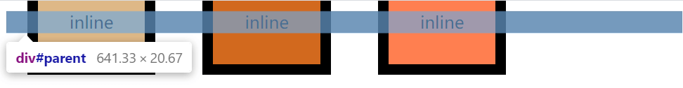
第一段话也很简单,在 IFC 中时水平一个一个放置的,只有水平方向上的 margin(外边距),border(边框)和 padding(内边距)有效。
先写一个例子验证前半句。
<style>
  .inline {
    display: inline;
  }
  #parent {
    background-color: grey;
  }
  #box1 {
    background-color: burlywood;
  }
  #box2 {
    background-color: chocolate;
  }
  #box3 {
    background-color: coral;
  }
</style>
<div id="parent">
  <div id="box1" class="inline">inline</div>
  <div id="box2" class="inline">inline</div>
  <div id="box3" class="inline">inline</div>
  <!-- 不换行,就不会有水平间隙 -->
  <!-- <div ...>...</div><div ...>...</div><div ...>...</div> -->
</div>
2
3
4
5
6
7
8
9
10
11
12
13
14
15
16
17
18
19
20
21
22
23
24
运行效果如下:
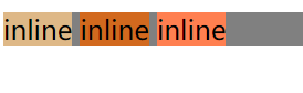
水平挨着一个一个放置。这里说是挨着放,可为什么水平还有间隙呢?其实这是我们代码里有换行符,按照相应的规范[9]会解析成空白符。
写一个例子验证后半句,为三个行内级元素加上 margin、border、padding 就可以发现只有水平的距离是起作用的。
<style>
  #parent {
    background-color: grey;
  }
  #box1 {
    background-color: burlywood;
    border: 10px solid;
    margin: 20px;
    padding: 30px;
  }
  #box2 {
    background-color: chocolate;
    border: 10px solid;
    margin: 20px;
    padding: 30px;
  }
  #box3 {
    background-color: coral;
    border: 10px solid;
    margin: 20px;
    padding: 30px;
  }
</style>
<div id="parent">
  <div id="box1" class="inline">inline</div>
  <div id="box2" class="inline">inline</div>
  <div id="box3" class="inline">inline</div>
</div>
2
3
4
5
6
7
8
9
10
11
12
13
14
15
16
17
18
19
20
21
22
23
24
25
26
27
28
待续
其实行内格式化上下文比较好分析,后续会将该篇内容拆分进行详细说明。
# body 是 BFC 吗?
根据我看过的文章,我发现有些人说html元素是 BFC、有些人说body元素是 BFC。其实大多数作者都只是搬运工,复制粘贴就完了。那么我交大家如何判断,自己去判断。
在上面的内容里,我们讲了浮动元素会使父元素高度坍塌问题。如果父元素是 BFC,可以避免这样的问题。那么我们可以利用这个现象来判断。
<style>
  #float {
    float: left;
    width: 50px;
    height: 50px;
    margin: 10px;
    background-color: burlywood;
  }
</style>
<body>
  <div id="float"></div>
</body>
2
3
4
5
6
7
8
9
10
11
12
打开控制台,我这使用的是 chrome 浏览器,移到html和body元素上查看。
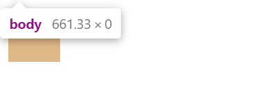
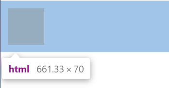
结果显而易见,body元素高度坍塌了,html元素高度是包含浮动元素的。
那么我让body元素加上overflow: hidden;,body元素高度还会坍塌吗?
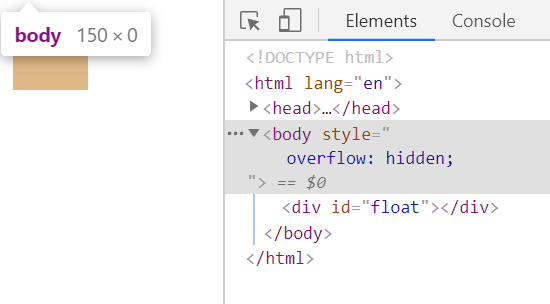
事实上body元素还是会高度坍塌,这里可能会有很多人感到疑问。这不是创建 BFC 了吗?为什么还坍塌了。是 BUG 吗?
其实这也是 W3C 的规则,只是我们忽略了这一条很隐蔽的规则,就在 BFC 的源文或译文中的第一段话。
点击查看 [W3C][译文] BFC 的第一段话
Floats, absolutely positioned elements, block containers (such as inline-blocks, table-cells, and table-captions) that are not block boxes, and block boxes with 'overflow' other than 'visible' (except when that value has been propagated to the viewport) establish new block formatting contexts for their contents.
浮动,绝对定位的元素,非块盒的块容器(例如 inline-blocks,table-cells 和 table-captions),以及’overflow’不为’visible’的块盒(当该值已被传播到视口时除外)会为其内容建立新的块格式化上下文。
overflow不为visible的块盒 (当该值已被传播到视口时除外) 会为其内容建立新的块格式化上下文。那么括号中是什么意思呢?
找到 W3C 中对overflow该属性的描述[7]。如下:
点击查看 [W3C] 'overflow'
Even if 'overflow' is set to 'visible', content may be clipped to a UA's document window by the native operating environment.
UAs must apply the 'overflow' property set on the root element to the viewport. When the root element is an HTML "HTML" element or an XHTML "html" element, and that element has an HTML "BODY" element or an XHTML "body" element as a child, user agents must instead apply the 'overflow' property from the first such child element to the viewport, if the value on the root element is 'visible'. The 'visible' value when used for the viewport must be interpreted as 'auto'. The element from which the value is propagated must have a used value for 'overflow' of 'visible'.
点击查看 [译文] 'overflow'
即使把'overflow'设置为'visible',内容也可能会被原生操作环境裁剪到 UA 的文档窗口中
UA 必须把设置在根元素上的'overflow'属性应用到视口上。如果根元素是 HTML 的"HTML"元素或者 XHTML 的"html"元素,并且该元素具有一个作为子级的 HTML 的"BODY"元素或者 XHTML 的"body"元素的话,如果根元素上该值为'visible',用户代理必须把第一个这种子级元素的'overflow'属性应用到视口上(而不是根元素的'overflow')。'visible'用于视口时,必须解释为'auto'。该值被传播的元素必须具有应用值为'visible'的'overflow'
提示
可能对 UA 这个词有些懵逼,可以理解成浏览器。我把 W3C 对其解释的范文也拿过来了,可以自行理解,就在本节内容最下方。
浏览器必须把设置在根元素上的overflow属性应用到视口上,用在视口上的overflow: visible需要解释成overflow: auto。但是有个情况特殊,需要符合以下情况:
- 根元素是
html - 根元素里有子级元素
body - 根元素的
overflow为visible
那么就把body元素上的overflow属性应用到视口上,并且body元素的overflow实际上的使用值是visible。
在刚刚写的代码中,这三个条件都符合,所以body元素上的overflow其实是应用在视口上的,并且使用值是visible(虽然在代码写的不是,但实际上是)。这种情况就是通过overflow不为visible来创建 BFC 的例外。因此body元素加上overflow:visible是不会创建新的 BFC 的。
提示
html元素的overflow的默认值是visible
那么又如何让body元素创建 BFC 呢?其实只需要打破上述的 情况 3:根元素的 overflow 为 visible。将html元素的overflow设置成不为visible的值,那么body元素的overflow也就不会应用在视口上了。这样再给body元素加上overflow属性值不为visible就会创建新的 BFC。
来验证我们的猜想:
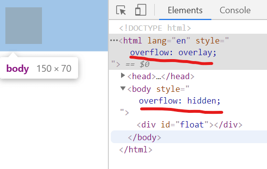
html元素的overflow也可以设置成hidden、scroll等都是可以的,只要不为visible(initial这种肯定不能算,因为就是默认值visible的意思)。
点击查看 [W3C] UA
A user agent is any program that interprets a document written in the document language and applies associated style sheets according to the terms of this specification. A user agent may display a document, read it aloud, cause it to be printed, convert it to another format, etc. An HTML user agent is one that supports one or more of the HTML specifications. A user agent that supports XHTML [XHTML], but not HTML is not considered an HTML user agent for the purpose of conformance with this specification.
点击查看 [译文] UA
用户代理是解释用文档语言编写的并应用了相关符合本文档术语的样式表的文档的任何程序。用户代理可能显示文档,把它读出来,打印出来,转化为其它格式等等 HTML 用户代理是支持一种或多种 HTML 规范的用户代理。为了与本规范的目标一致,支持 XHTML[XHTML]但不支持 HTML 的用户代理不是 HTML 用户代理
# 其他
网上大部分对 BFC 的总结,都是以下模板。如果你是直接跳过上面内容,来到这里,我就想问你:为什么 BFC 布局规则、创建方式是这样?有什么依据吗?依据就是网友总结吗?网友又是根据什么得出来的?其中布局规则中的第六条,又是为什么?
小时候经常读鲁迅的文章,很多很多所谓的标准答案。这些标准答案真的是作者内心所想吗?如果鲁迅从棺材爬出来说:“其实真没什么意思。” 那真是滑天下之大稽了。不过在计算机的世界里没有文学这一说,一加一就是等于二,而不是男女搭配干活不累,一加一大于二。如果有人向你抛出上述的问题,希望你能理直气壮的说出:“CSS 规范由 W3C 制定,在 W3C 文档中就是这么说明的,所以它必须就是这样。” 然后在文档里指出来相应的地方。
BFC 布局规则:
- 内部的 Box 会在垂直方向,一个接一个地放置。
- Box 垂直方向的距离由 margin 决定。属于同一个 BFC 的两个相邻 Box 的 margin 会发生重叠
- 每个元素的 margin box 的左边, 与包含块 border box 的左边相接触(对于从左往右的格式化,否则相反)。即使存在浮动也是如此。
- BFC 的区域不会与 float box 重叠。
- BFC 就是页面上的一个隔离的独立容器,容器里面的子元素不会影响到外面的元素。反之也如此。
- 计算 BFC 的高度时,浮动元素也参与计算
BFC 创建方式:
- 根元素
- float 属性不为 none
- position 为 absolute 或 fixed
- display 为 inline-block, table-cell, table-caption, flex, inline-flex
- overflow 不为 visible
注意
display:table本身并不产生 BFC。但是,它可以产生匿名框,其中包含display:table-cell的框会产生 BFC。总之,对于display:table的元素,产生 BFC 的是匿名框而不是 display:table。
# 参考
参考
- [1] [W3C] 关于 CSS 2.1 规范 (opens new window)
- [2] [译文] 关于 CSS 2.1 规范 (opens new window)
- [3] [W3C] 视觉格式化模型 (opens new window)
- [4] [译文] 视觉格式化模型 (opens new window)
- [5] [W3C] 视觉格式化模型细节 (opens new window)
- [6] [译文] 视觉格式化模型细节 (opens new window)
- [7] [W3C] 'overflow'属性 (opens new window)
- [8] [译文] 'overflow'属性 (opens new window)
- [9] [W3C] 'white-space'属性 (opens new window)
- [10] [译文] 'white-space'属性 (opens new window)
- [11] [MDN] 视觉格式化模型 (opens new window)
- [12] [MDN] 块格式化上下文 (opens new window)
- [13] [W3C] 网格布局 (opens new window)
- [14] [W3C] 自适应 (opens new window)
- [15] 视觉格式化模型 (opens new window)